Dashboard Overview #
The Dashboard is your home screen in DnXT Publisher. It provides an at-a-glance summary of your current workload, quick access to common actions, and powerful analytics about your organization’s publishing activity. The Dashboard is divided into two main tabs: the Tasks Tab (shown by default) and the Intelligence Tab. Together, these tabs give you everything you need to prioritize your work and understand publishing trends across your team and organization.
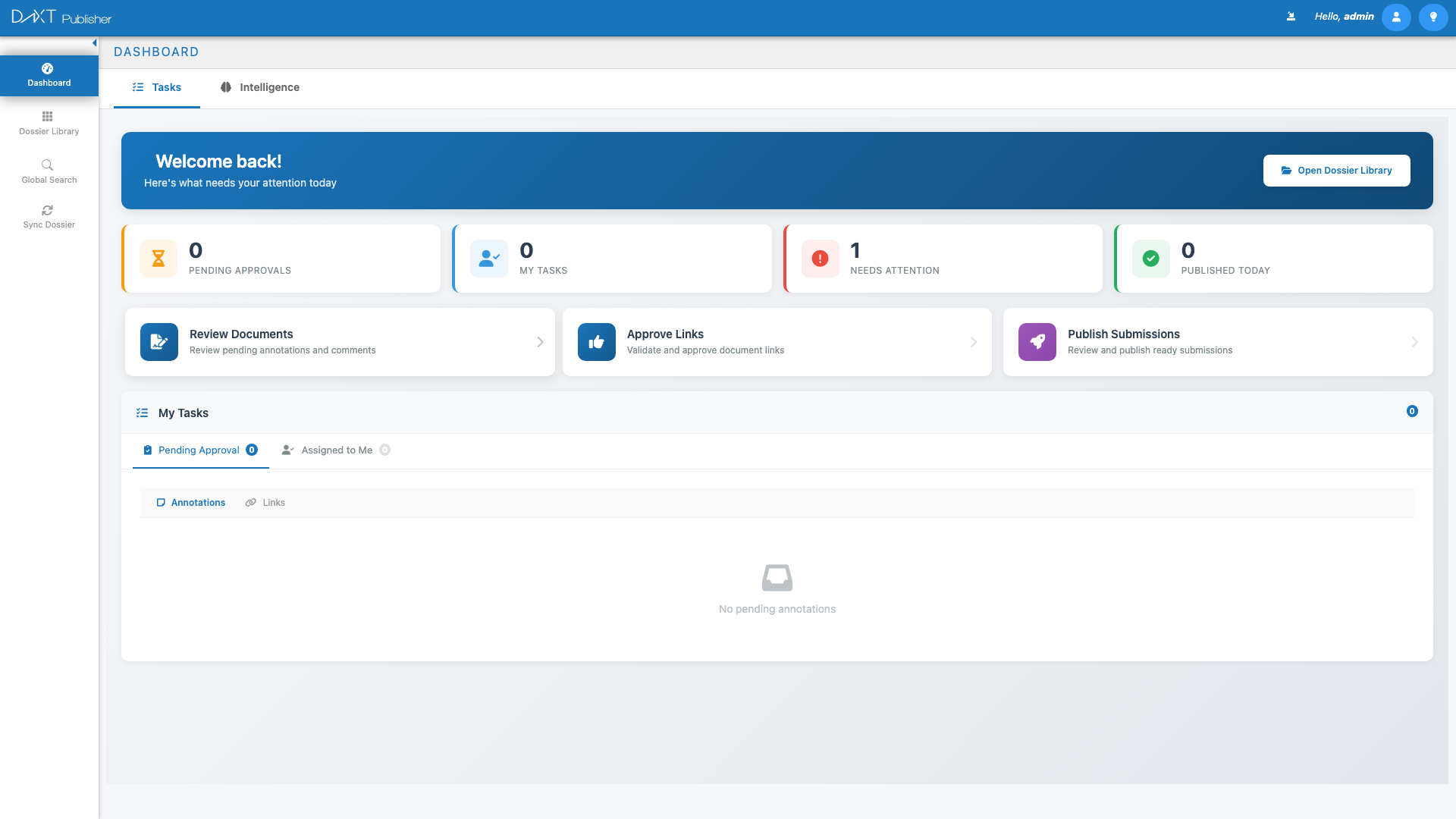
Tasks Tab #
The Tasks tab is the default view when you open Publisher. It is designed to help you quickly understand what needs your attention and jump into the most common workflows without navigating through multiple screens.
Welcome Header #
At the top of the Tasks tab, you will see a personalized welcome message with your name. Next to it is the Open Dossier Library button, which takes you directly to the Dossier Library — the central workspace for managing all your dossiers and submissions. This button provides the fastest path from login to your dossier collection.
Quick Stats Row #
Below the welcome header, four statistic cards provide a real-time snapshot of your workload:
| Stat Card | What It Shows |
|---|---|
| Pending Approvals | The number of documents or hyperlinks waiting for your approval. Click to see the list of items requiring your sign-off. |
| My Tasks | The total number of tasks currently assigned to you, including document reviews, link verifications, and other action items. |
| Needs Attention | Items flagged as requiring immediate attention, such as overdue tasks, validation failures, or blocked workflows. |
| Published Today | The number of submissions that have been successfully published today, giving you a sense of daily throughput. |
Quick Action Cards #
Below the stats row, three quick action cards provide one-click access to the most common publishing workflows:
- Review Documents — Opens a filtered view of documents that are awaiting your review. This is particularly useful for team leads and quality reviewers who need to process document queues efficiently.
- Approve Links — Takes you to the hyperlink approval queue where you can review, approve, or reject cross-reference links within submissions. Link approval is a critical step before publishing.
- Publish Submissions — Opens a list of submissions that are ready for publishing, allowing you to initiate the final publishing workflow quickly.
My Tasks Panel #
The lower section of the Tasks tab contains the My Tasks Panel, which provides a detailed, filterable list of your assigned work items. This panel has two primary views:
Pending Approval View #
Shows all items that are waiting for your approval. This includes documents that have been submitted for review and hyperlinks that need verification. Items are listed with their name, dossier context, submission number, date submitted, and requester name.
Assigned to Me View #
Shows all tasks that have been assigned to you by team members or by workflow rules. Within this view, you can toggle between two sub-tabs:
- Annotations — Shows annotation tasks where you need to review or respond to comments on documents within submissions.
- Links — Shows hyperlink tasks where you need to create, verify, or fix cross-reference links in the submission TOC.
Intelligence Tab #
The Intelligence tab transforms your Dashboard into an analytics center. It provides visualizations and charts that help you understand publishing patterns, team productivity, regional distribution, and submission status across your organization. This is particularly valuable for regulatory affairs managers and directors who need to monitor team performance and resource allocation.
Click the Intelligence tab at the top of the Dashboard to switch from the Tasks view.
Publishing Trend Chart #
The Publishing Trend line chart shows the volume of submissions published over time. The x-axis represents time periods (days, weeks, or months, depending on the selected range), and the y-axis represents the number of published submissions. This chart helps you identify busy periods, track whether your publishing velocity is increasing or decreasing, and plan resource allocation accordingly.
Recent Activity Feed #
The Recent Activity Feed provides a chronological list of notable events across your Publisher workspace. This includes new dossier creations, submission publications, validation completions, and other significant actions taken by team members. Each entry shows the action taken, the user who performed it, and a timestamp. This feed is invaluable for staying aware of team activity without checking individual dossiers.
Dossier Count by Region Map #
An interactive world map displays the geographic distribution of your dossiers. Regions are highlighted based on the number of active dossiers, with color intensity indicating volume. Supported regions shown on the map include:
- AU — Australia
- US — United States
- JP — Japan
- CA — Canada
- HR — Croatia
- ZA — South Africa
- CH — Switzerland
- TH — Thailand
- SG — Singapore
- EU — European Union
- GCC — Gulf Cooperation Council
Hover over a region to see the exact dossier count. Click on a region to filter other charts on the Intelligence tab to show data for that region only.
Submissions by Region Chart #
A doughnut chart breaks down the total number of submissions by region. Each segment represents a region, color-coded for easy identification. Hover over a segment to see the region name, submission count, and percentage of total submissions. This chart complements the map view by providing precise numeric data in a compact visual format.
Reviewer vs Publisher Chart #
A stacked bar chart compares the activity levels of reviewers versus publishers across a defined time period. This visualization helps managers understand the balance of work between reviewing and publishing roles, identify bottlenecks, and optimize team composition. Each bar represents a time period, with the reviewer activity stacked on top of publisher activity.
Submissions by Status Chart #
A doughnut chart shows the distribution of submissions across different workflow statuses (such as Draft, In Review, Approved, Published, and Rejected). This gives you an immediate understanding of where your submissions are in the publishing pipeline and whether any status category has an unusual backlog.
Navigating from the Dashboard #
The Dashboard is designed as a launchpad. Here are the most common navigation paths from the Dashboard:
| Starting Point | Action | Destination |
|---|---|---|
| Welcome Header | Click Open Dossier Library | Dossier Library (All Dossiers tab) |
| Quick Action Cards | Click Review Documents | Document review queue |
| Quick Action Cards | Click Approve Links | Hyperlink approval queue |
| Quick Action Cards | Click Publish Submissions | Publishing-ready submissions list |
| My Tasks Panel | Click any task item | Relevant dossier/document in the TOC Editor |
| Left Navigation | Click any navigation item | Corresponding workspace view |
Customizing Your Dashboard Experience #
While the Dashboard layout is standardized, there are several ways to tailor it to your needs:
- Use stat card clicks to filter tasks — Click any stat card to focus the My Tasks Panel on that specific category.
- Toggle between tabs frequently — Start each day on the Tasks tab to see your immediate to-do list, then check the Intelligence tab weekly or monthly to review trends.
- Bookmark the Dashboard — Publisher always opens to the Dashboard, but bookmarking it ensures you can return quickly from any other view.
Frequently Asked Questions #
How often are the Dashboard statistics refreshed? #
The Dashboard statistics refresh automatically each time you navigate to the Dashboard or refresh your browser. The data reflects the most recent state of your workspace at the time of loading.
Can I customize which charts appear on the Intelligence tab? #
The Intelligence tab layout is currently fixed, showing the standard set of publishing analytics. All users with access to the Intelligence tab see the same chart types, though the data shown depends on their permissions.
Why does my “Published Today” count show zero? #
The “Published Today” counter resets at midnight (based on your server’s time zone). If no submissions have been published since midnight, the count will be zero. This is normal behavior at the start of the workday.
Can I access the Dashboard from any screen? #
Yes. Click Dashboard in the left navigation panel from any screen in Publisher to return to the Dashboard at any time.
Do the Intelligence tab charts include data from DnXT Reviewer? #
The Intelligence tab focuses on Publisher activity. However, the Reviewer vs Publisher chart does incorporate cross-module data to provide a holistic view of the review-and-publish pipeline.
Related Articles #
- Getting Started with Publisher — First-time setup, login, and orientation guide.
- Dossier Library: Managing Dossiers — Manage your dossiers and submissions in the Library view.
- Filters, Favorites, and Views — Learn about the filter system, favorites, and view toggle options.
- Validating and Publishing — Understand the publishing workflow from validation to final output.